Planning - ClassTopBase
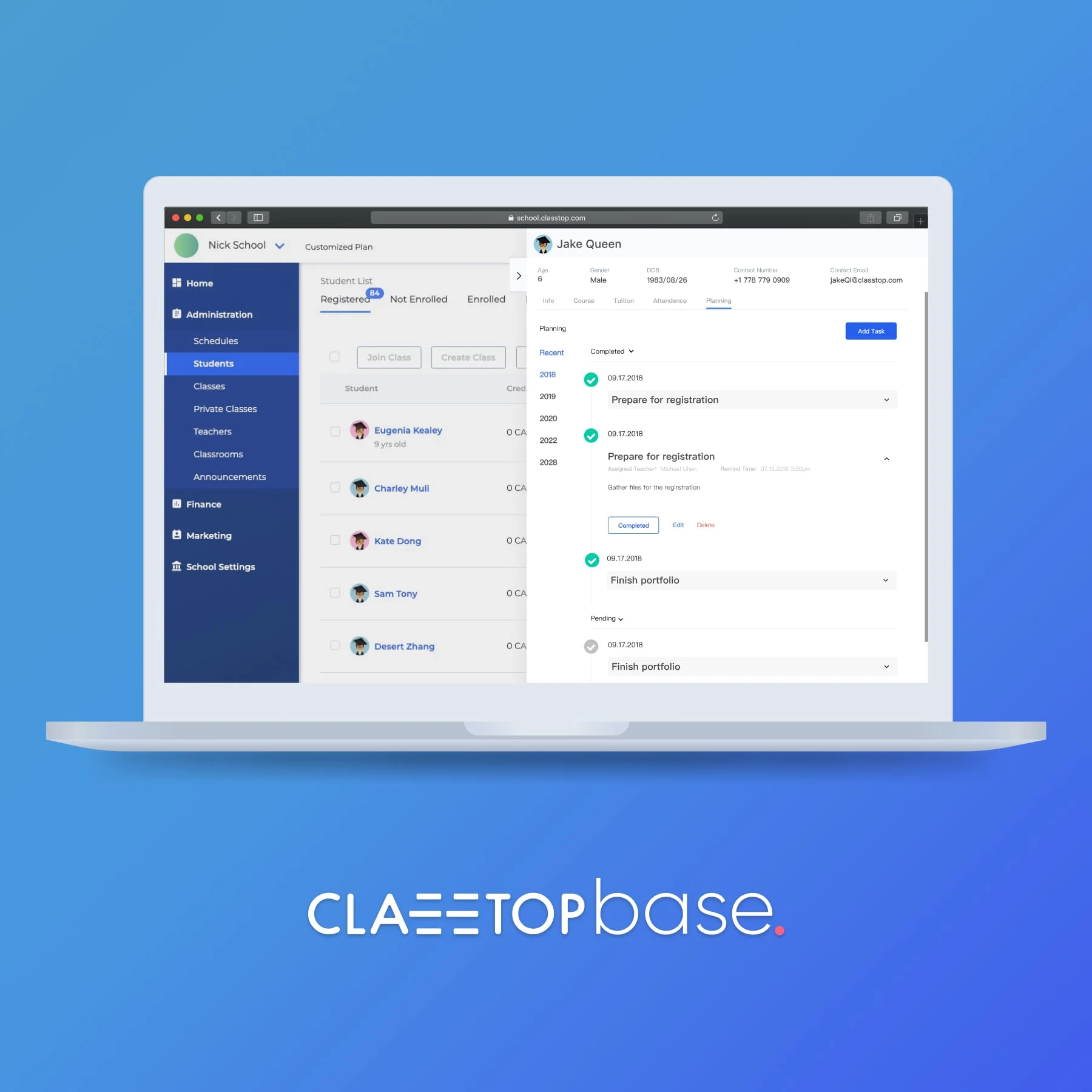
A planning feature for a school management software for after-schools
Link: https://base.classtop.com
ClassTopBase is a school management software for after-schools. It allows school administrators to manage students, teachers, and classes. I joined the team in 2018 as a solo product designer. I have worked on many aspects of this product, including shaping new features, implementing design system, writing CSS. Here, I will talk about the planning feature I designed for ClassTopBase.
The Users
School administrators from after schools that have 50-200 students.
My role and who I worked with
Product Designer working with developers and PM.
Tools Used
Sketch, InVision, VS Code
The problem
One of our long term customers told us about their biggest pain point in daily management. They had nothing to help them map out their student’s future academic plans. They were doing everything on Google Doc, and it was hard to keep track of dozens of students. There was no automatic way to notify students about the due date.
The solution
We created a feature that could help them map out their student’s future academic planning. It worked like a to-do list but integrated into our SaaS. It can send notifications to students and teachers when needed.
Impact and results
This customer loved this feature. It was the exact solution to their problem. More schools have expressed their interests in this feature and purchased our product subsequently.
My Process
Gather Information - Sketch - Wireframe - Design - Usability Testing - Build
Gather Information
After getting feedback from our salespeople, we believed this is an exciting problem space to explore. We decided to ask some other customers to see if they encountered similar issues and how they were able to tackle them. Some of our customers are using calendars or paper and pen to work on this. But none of the solutions will allow the integration with our platform. We believe that if we can find a way to solve this problem, we can boost the productivity of our customers.
Sketch
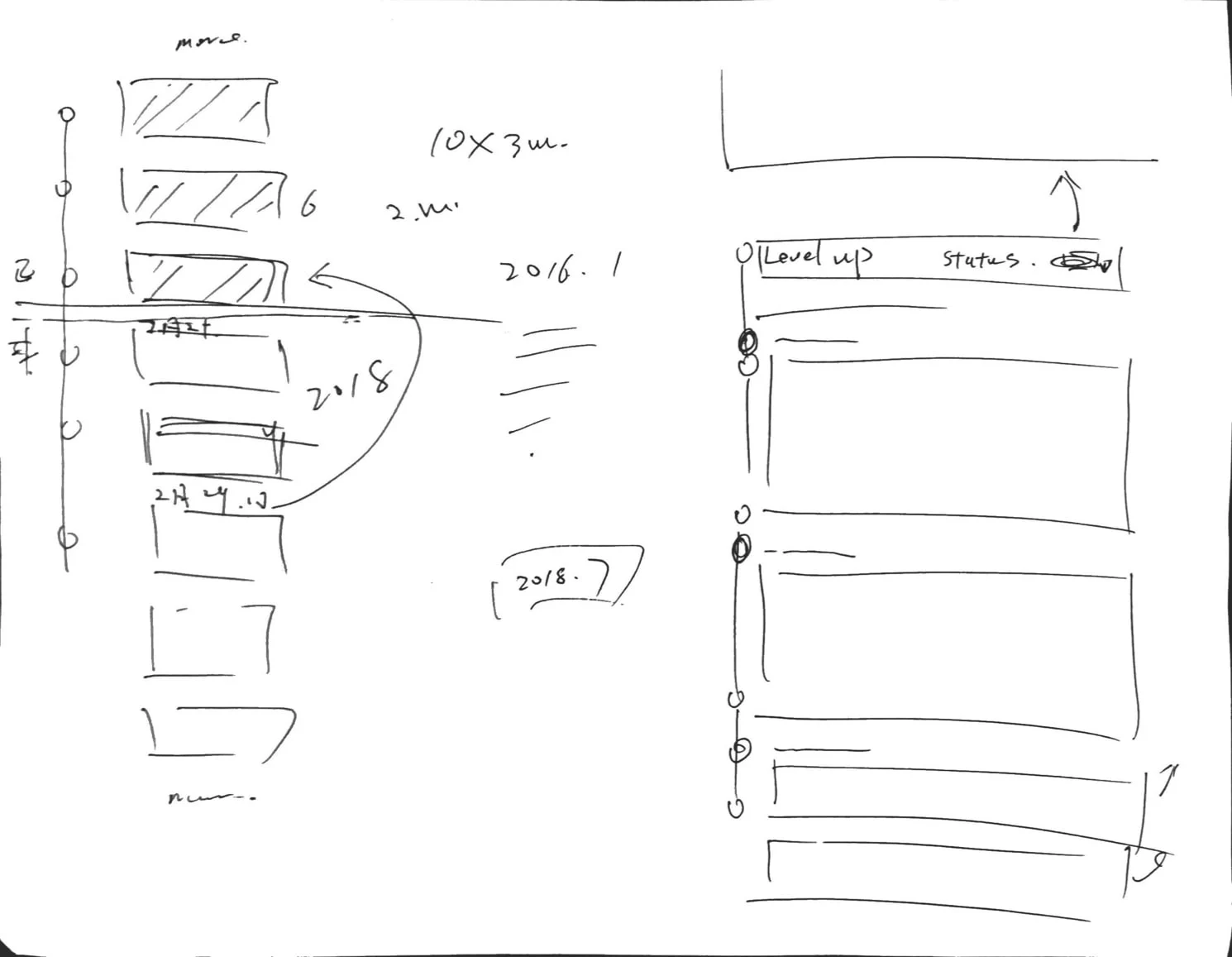
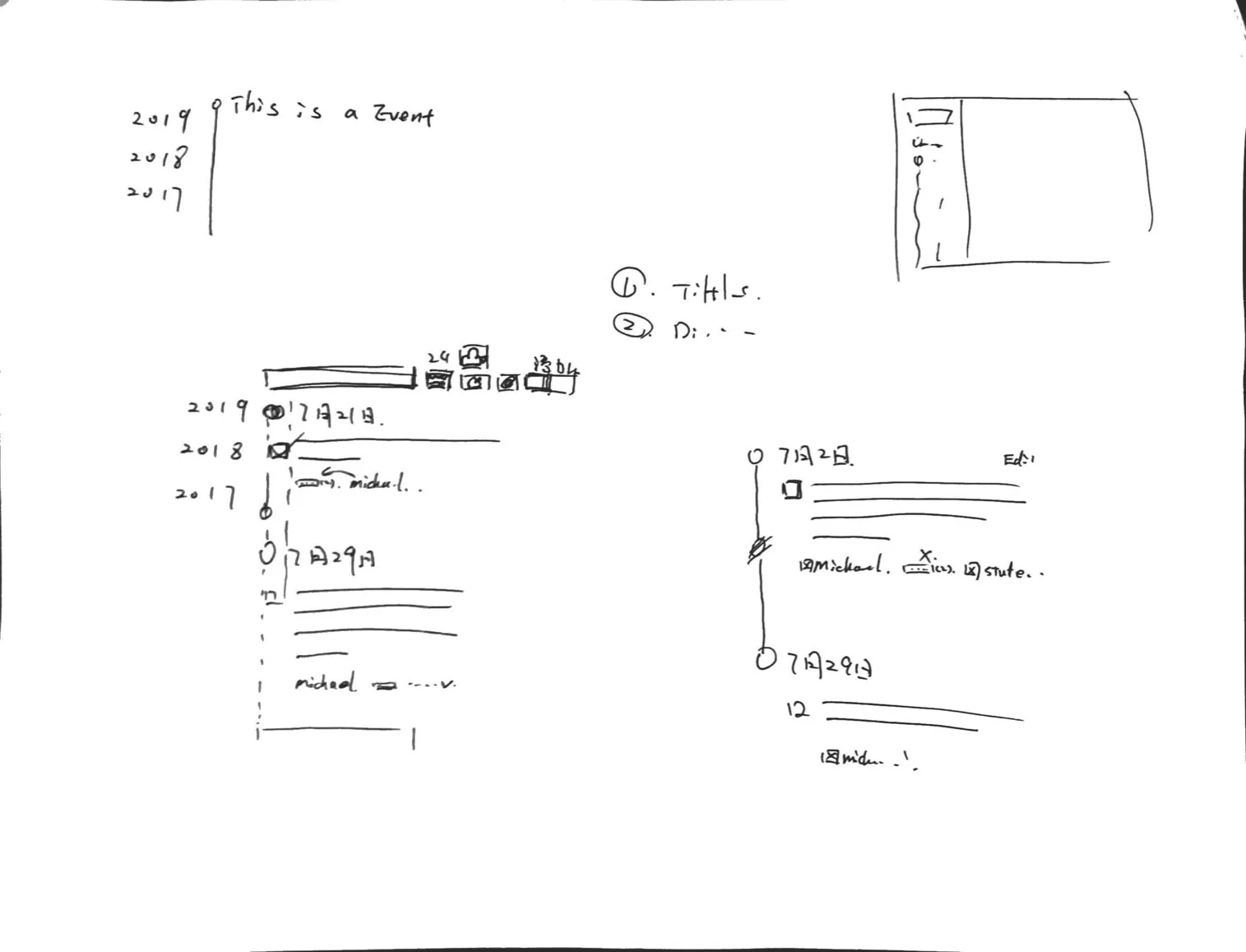
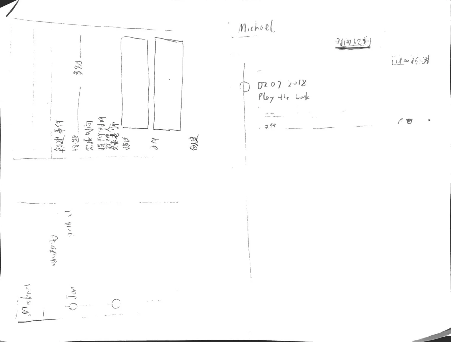
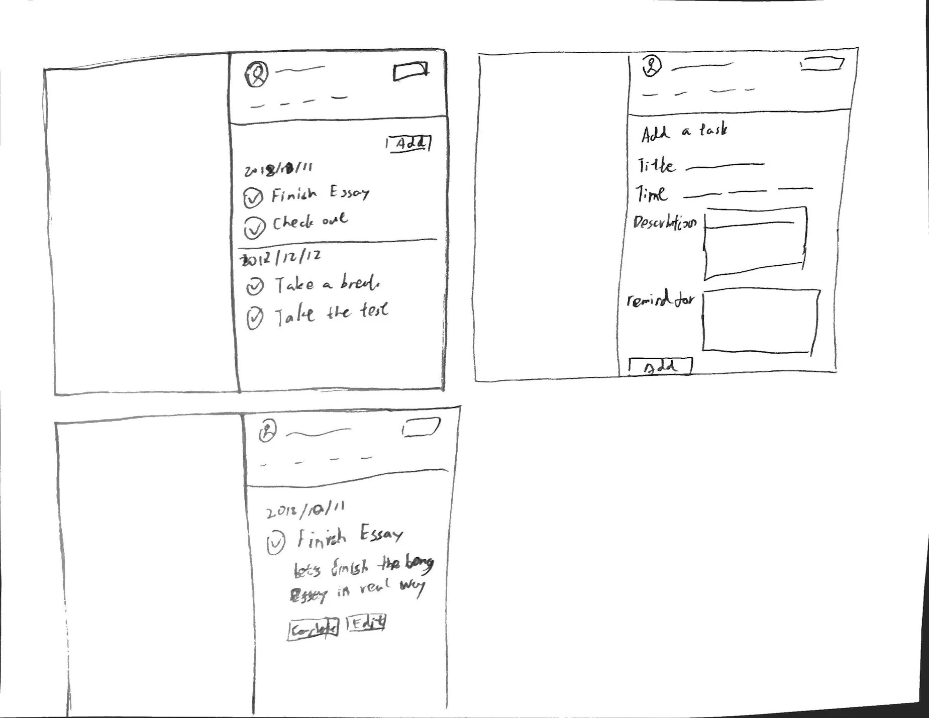
It seems like a to-do list could benefit the user to allow for better clarification. After exploring different ideas, I settled on laying out tasks into a timeline format. It helped to see the progression of each task. Usually, whenever schools did their academic planning, it would run over many years. So, I created a dropdown to filter different years.
Wireframe
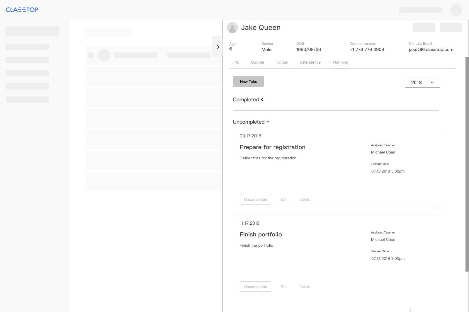
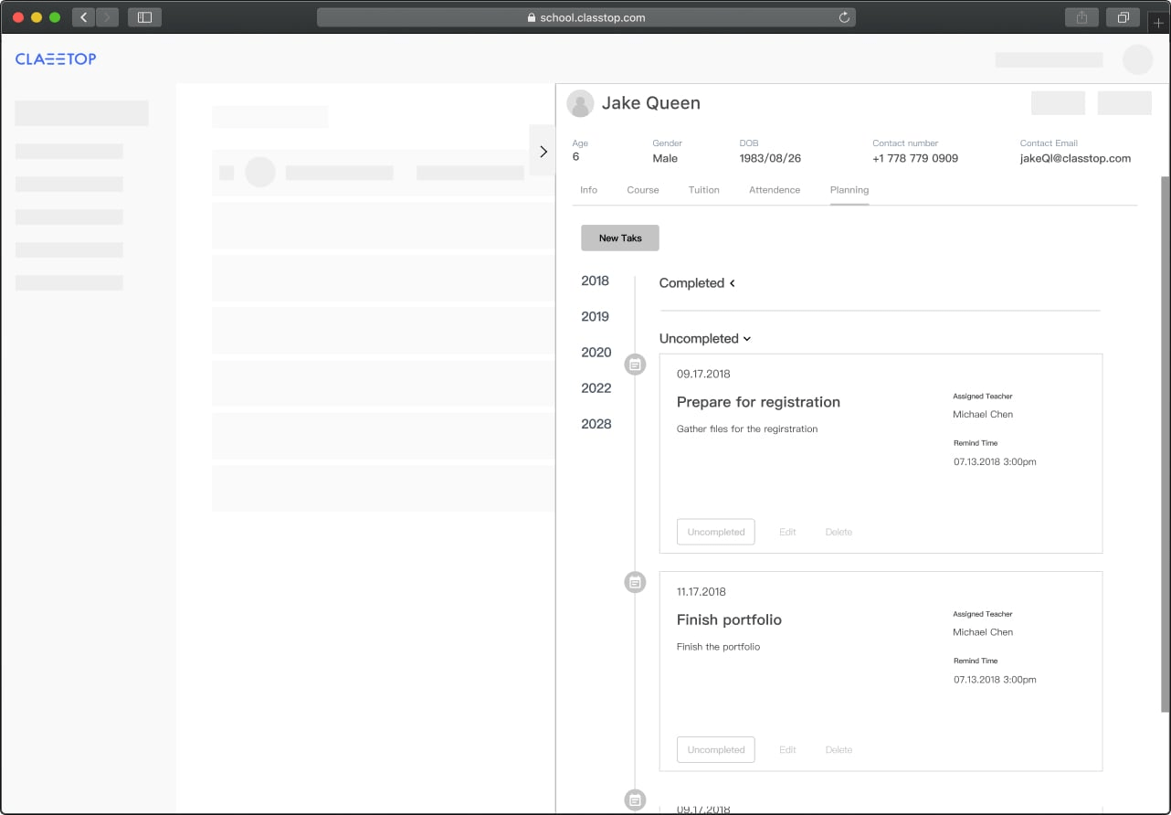
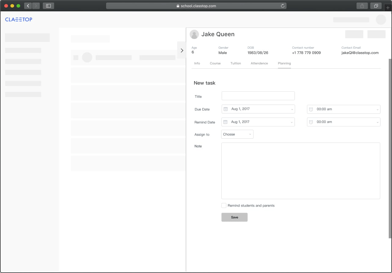
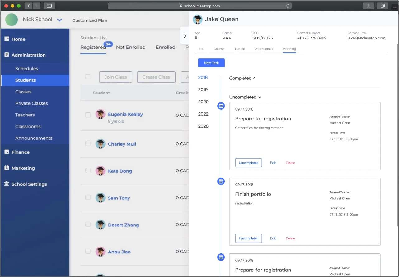
When I worked on the wireframe, I laid out each year on the left, instead of a dropdown. By doing so, it became much easier to see which year have tasks. I also sorted the tasks into uncompleted and completed sections for easier navigation.
Design
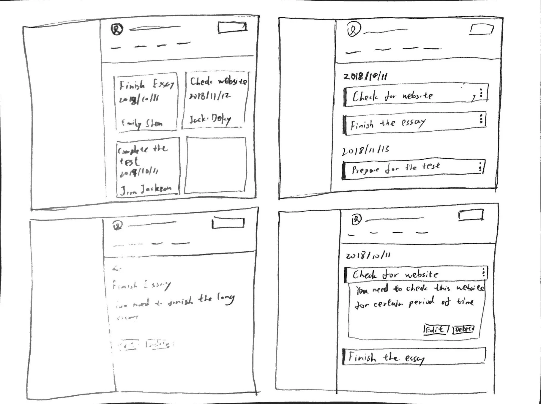
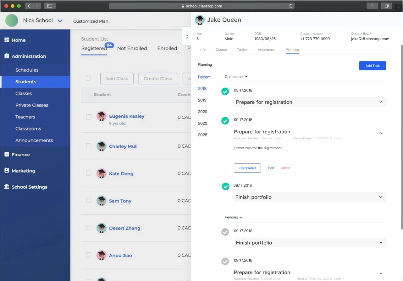
In the wireframe, I put every detail of one task in a bordered box. Based on the feedback I got from team members, the design was visually crowded and took too much vertical space. So after few changes, it only showed the task title in the list view. Once the user clicks on the task, it will expand to show the detail. I also tried to use less border and made use of background colours and white spaces to show the difference.
Usability Testing
Before we implemented the design, we conducted a usability test to gain customer feedback. I started the recruiting and screening process myself. We recruited a few people that are working in administrative positions at various companies. They had no prior knowledge of our software, and they share similar technology skills as our current users.
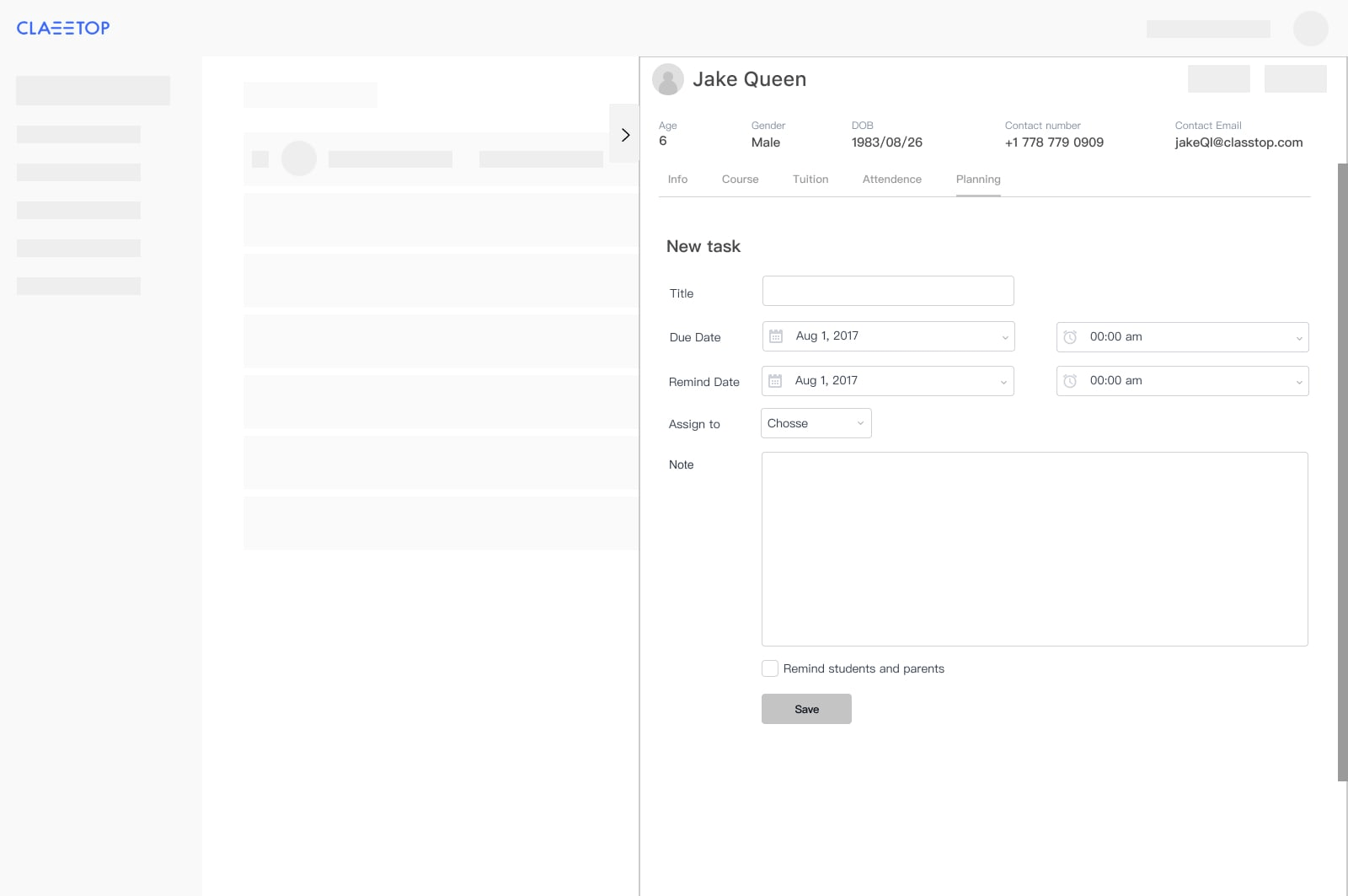
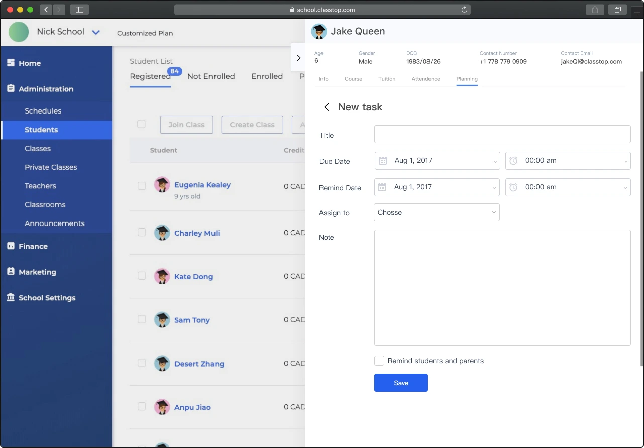
The goal of this testing was to examine whether our testers can successfully create a task for a student and edit it to mark it complete. All of our testers completed their tasks. One tester said he wished there was a way to let him know the condition of incomplete tasks before opening the planning panel. That sounds like a useful feature. However, we are thinking of adding a notification feature to the software. So we decided to explore more options during that time.
I wish there is a way to tell me how many incomplete tasks this student has. Right now, I have to click into the planning panel.
Build
After the developer built the product, I tested it to make sure it’s bug-free. I also changed the CSS to make sure it is similar to the design.
Challenges & Key Learnings
Early adopters’ feedback can be vital. However, it is still important to test feedback with other potential users.
Check out my other work
-
ClassTopBase Website
A website design for ClassTopBase school management software
-
Dashboard - ClassTopBase
A dashboard feature for a school management software aiming for after-schools
